
Decorating for Summer: Color Palettes for the Home & Patio
Contribution from freelance writer Kristina Marshall
Celebrate a perfect summer season with the right vibes and ambiance by choosing the perfect color for your home. If you don’t know too much about color rules, don’t worry! This blog post is all about color palettes for the home and patio so that you can get ready with some inspiration.
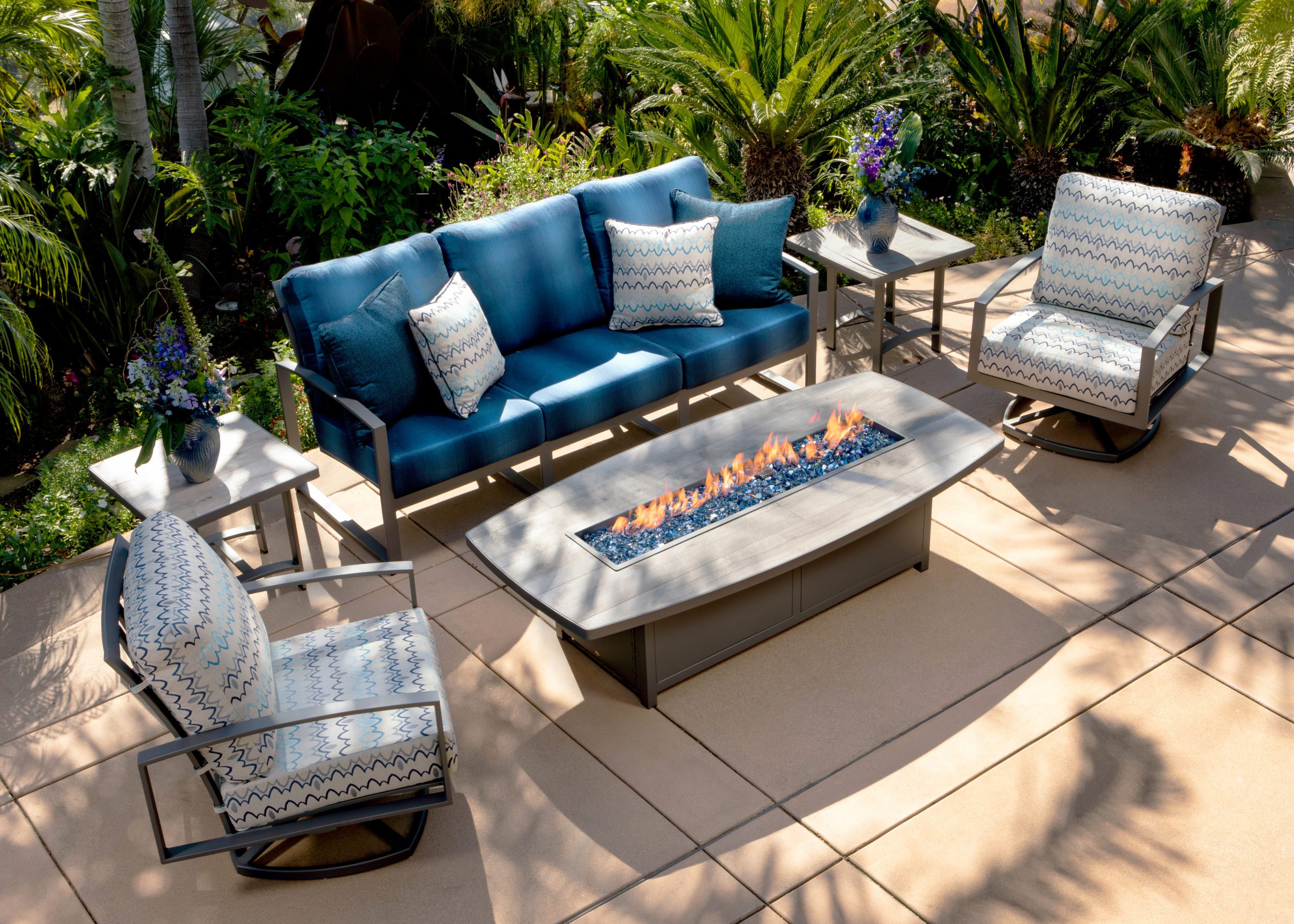
Zen Oasis Color Palette with OW Lee Aris
A Zen color palette for the home might be all cool and earthy tones of gold, greens, browns. Of course, you could use a lot of wood accessories for this type of look as well.
Zen Garden colors include:
• Browns and gold
• Grays, yellows
• Purples
You could also have some cool grays with oranges for a refreshing look. This is especially good if you’re looking to avoid the monotone colors of wintertime. Use lighter shades like blues or greens as accent colors against darker neutrals like browns and tans for your patio.
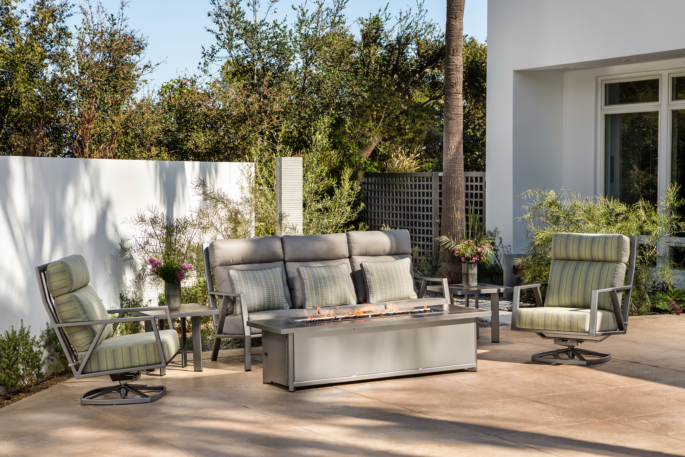
Mediterranean Color Palette with OW Lee San Cristóbal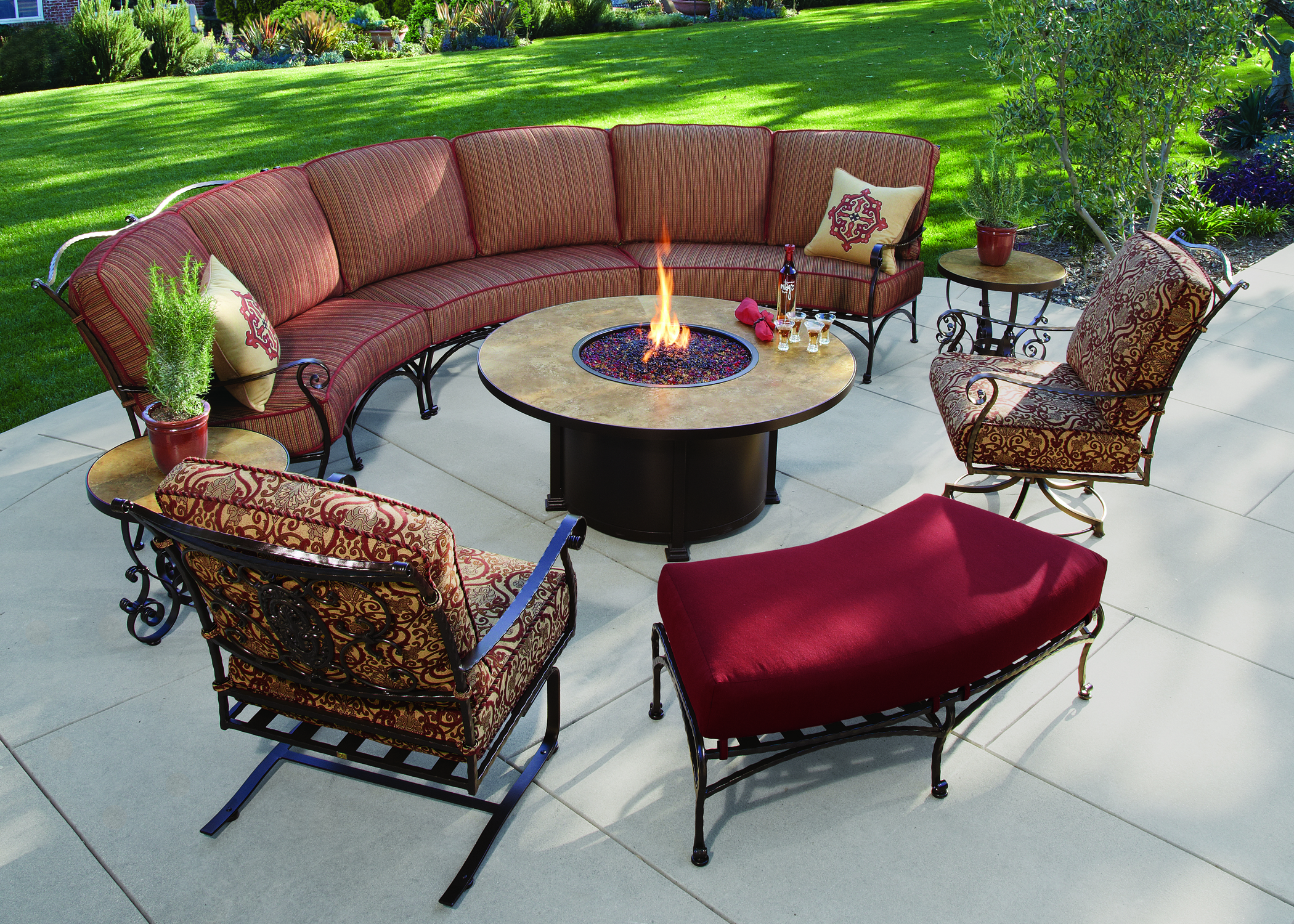
A Mediterranean color palette is a beautiful addition to any home. It’s bright and colorful, with an earthy undertone that creates a sense of warmth.
Mediterranean colors include:
- Light Reds, oranges, and yellows
- Olive green, forest greens, and navy blues
- Creamy white with touches of beige or brown.
A Mediterranean color palette is perfect for summertime because its sunny qualities help keep everyone in a good mood! These colors are also very versatile, so that you can bring them indoors as well. Whether it’s in the patio outdoors or your living room at home, this family will make everything look brighter. Just remember that these tones tend to have more yellow than blue undertones, which pairs beautifully with natural light from the sun during daytime hours as long as there isn’t too much direct sunlight shining on the surface.
Turquoise and Cream with OW Lee Grand Cay
 This colour combination is playful, cheerful, and fresh. These colors are perfect for patio ideas with a bohemian vibe or beachy feel. Turquoise will look stunning paired with white cream and orange or peach tones for a breezy summer effect in home decorating.
Gold and Royal Blue
Gold and royal blue are two colours that prompt feelings of tranquillity. These colors are perfect for patio ideas with a modern or romantic vibe and in-home decorating projects where you want to create an airy and light environment.[/vc_column_text][ultimate_spacer height=”30″][vc_column_text]Baby Blue and Pearly Pink
Baby blue and pearly pink are two softer colours. They create a sweet, child-like atmosphere. These two colours are perfect for decorating a room that is meant to be full of fun and laughter.
Brick Red and Tan with OW Lee Classico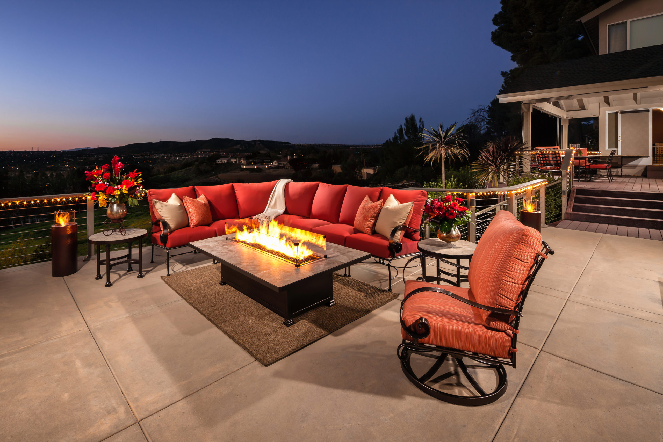
Brick red and tan are great for any room where you want a more ‘rustic’ feel. These two colours are perfect for decorating the patio or home when you want to give off that cozy, cabin-in-the-woods vibe.
Blush and Dark Olive
Blush and dark olive work great for any room where you want to create a romantic ambiance. These colours are perfect for decorating the patio when you’re looking to have an intimate, secluded space with low lighting, candles or firepits scattered about.
Sand and Navy with OW Lee Pacifica
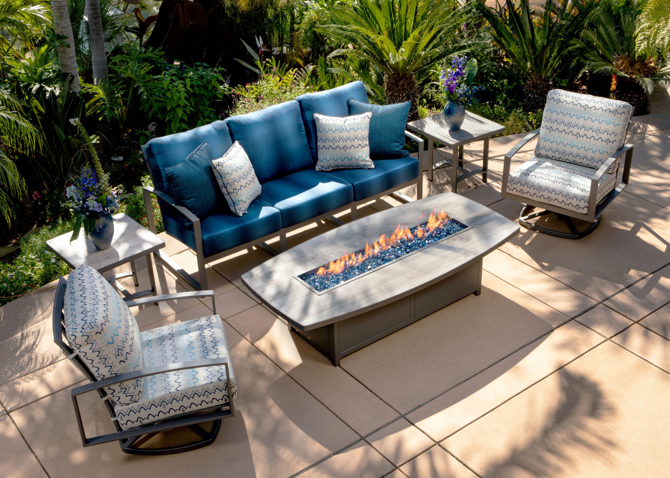 Sand and navy are perfect for beach-themed decorating. These two colours are a great choice when looking to create an environment that is reminiscent of summertime relaxation and the feeling of sandy toes in seawater.
Yellow and Gray
Yellow and gray work well for a traditional summertime feel. These two colours are perfect if you’re looking to create a more ‘beachy’ atmosphere on your patio with the addition of palm trees and decorations that make it seem like you’re in an exotic location far from home.
Yellow and White
Yellow and white are a classic summertime colour palette. These two colours work well if you’re looking to have a more ‘beachy’ atmosphere around your patio while also giving your house that traditional feel using white wicker furniture and other items in the home.
Mint and Pale Gray
Mint and pale gray together are a great colour palette for those who want a more contemporary feel to their home and patio. This colour combination is popular among homeowners with children or pets as it has a calming effect on both people and animals alike.
Blush and Mahogany
Blush and mahogany are two colours that are perfect for the home. These colours together make a fantastic coordinated set that can be used in any room of your house, not just the living area or patio.
Blush is a soft colour while mahogany has a bold look, and these two work well when paired with one another as they each add something different to the setting. This combination will also give you room to experiment as they complement many other colors. Try adding a modular sofa, which gives you even more ways to experiment without worrying about matching the color up with other items in your decorating scheme!
Sapphire and Mustard
Sapphire and mustard work well together on the patio as they can be used to create a more outdoorsy feel. These colours will also work well with other pieces you may already have in your home if you’re looking for an easy way to spruce up your outdoor area!
Conclusion
When deciding on the perfect palette for your home or patio, consider how these colors will look together and what they’ll bring out in each other. You might want to use darker shades as an accent wall while using lighter tones throughout the space. Have any of these color schemes inspired you?